As far as I’m concerned, we’re living in the true golden age of comics. In addition to comics-based properties dominating movie grosses, many classic comics and comic strips are being collected in their entirety in quality editions for posterity, and books both for casual readers and serious scholars are plentily available about the history and phenomenon of the medium and for those interested in comics-related careers.
This wasn’t always the case. When I first became seriously interested in cartooning and comics history, books on these subjects were not so ubiquitous or easy to come by. As an adolescent, I spent a great deal of time scouring bookstores and libraries for books on the subject (partly to validate my enthusiasm) and, in turn, went through their bibliographies to track down more.
Over several blogs I plan to talk about many of the early books that introduced me to the rich history of the medium. Some of them I own, others I borrowed countless times from my local library to pore over. They are the foundation of my knowledge about the history of comics, and some of them remain classics in the field.
Comic Art in America by Stephen Becker (1959)
I discovered this book in the early 1970s at my local branch of the New York City Public Library, and it was one I borrowed frequently. One of the earliest books to provide a comprehensive history of comics to date at the time of its publication, it introduced me to the founding days of American cartooning and the newspaper comic strip form, on which the whole subsequent comics industry was built. It was in these pages I learned about the earliest history of the medium, and was first introduced to the great newspaper strips, including those that would serve as my main inspirations like Milton Caniff’s Terry and the Pirates.
Given its broad coverage of the subject, Comic Art in America only provided a few examples of the strips covered in its pages. So while I was thrilled to be given a glimpse into the artistry and storylines of the strips, being given a one-day excerpt of an adventure strip also was quite a tease. I realize now that the exoticism and sense of adventure implied in these small excerpts served to fuel my own imagination as I filled in the blanks with my own mind. It wasn’t until many years (and decades) later that I would finally see the context of many of these excerpts when the full collections of many of these strips began to be released.
Comics and Their Creators by Martin Sheridan (1941, reissued 1973)
When this book was originally released in 1941, it was among the first to provide a serious overview of comics, primarily consisting of first hand “oral histories” from artists, with a chapter devoted to individual cartoonists and their work. Many subsequent historians—including Becker—drew extensively from Sheridan’s work (as did many who, in turn, referenced Becker). This book was re-released in 1973 as Classic Comics and Their Creators, which is the edition I own. I remember asking my parents to mail-order this book for me when I saw an advertisement for it. Though readers will find featured here the usual giants of the time such as Caniff and Alex Raymond, also included in the book are less well-remembered cartoonists, as well Superman creators Joe Shuster and Jerry Siegel, though the focus primarily is on the Superman daily adventure strip.
The Comics: An Illustrated History of Comic Strip Art
by Jerry Robinson (1974)
I believe this book was purchased for me at the Barnes and Noble annex in New York City. Though the book moves swiftly through the history of comics, it brings the history of the daily newspaper strip up to date through the early 1970s. Robinson is a successful cartoonist himself, who entered the industry as an assistant on Bob Kane’s Batman and is generally credited with creating the design of the Joker. Robinson has enjoyed a various and successful career, and also has been one of the most outspoken and effective ambassadors for the field. I had the privilege to have Robinson autograph this book for me at a meeting of the Cartoon Arts Professional Society. (Robinson also played a key role in getting DC Comics and Warner Brothers to credit Shuster and Siegel as the creators of Superman, and to procure an annual stipend for them.)
Below is the finished image for my WCG Comics holiday card. To see it with the holiday message visit the WCG Comics website.
Every year I also produce a personal holiday greeting card featuring myself and my family. Below is the image for this year's card. My wife mentioned that she loves the fact that each year's card shows the children getting older while we haven't aged!Happy holidays to all!
UPDATED 12/11/08: Since posting the image below of the cover to the next issue of Rob Hanes Adventures, I've since learned that the guest artist who drew the cover, Benton Jew, has recently had an 8-page story published in a Hulk Family one-shot, and has another story in the pipeline scheduled for Marvel's new wave of online comics! For details, visit Benton's Blog! And, of course, click on the image below to see his cover in detail!
To mix things up a bit, for the first time ever I have invited a guest artist to provide the cover to the next issue (#12) of Rob Hanes Adventures! (Click on the image to see it full size.)
The cover above is by professional illustrator/storyboard artist/comic-book artist Benton Jew. More examples of this outstanding artist's work can be found at his blog.
Benton is a professional acquaintance from way back, dating back to when he worked at George Lucas' visual effects company Industrial Light & Magic before going freelance. He is one of the finest artists I know.
As noted in an earlier blog entry, in issue 12, Rob is stranded on a desert isle with a beautiful female felon he has been hired to extradite back to the United States from Japan after his plane goes down in the Pacific. Preview pages from the story may be found here.
In addition to comics and playing outside, one of my big interests when I was growing up was World War II. I loved playing guns in the woods where I grew up (when it snowed, it evoked for me being in the Ardennes during the Battle of the Bulge). Each week I dutifully checked the television schedule to note any World War II film that might be playing. (My childhood and adolescent years took place during the late 1960s through the ‘70s). Favorite films in the genre were the Longest Day, To Hell and Back, the Dirty Dozen and Go for Broke.
So, of course, Our Army at War featuring Sgt. Rock was a natural for me, combining my love for both comics and World War II. In addition to Detective Comics which featured Batman, Our Army at War was the first comic-book series I collected regularly. In fact, after I realized the significance of issue numbers, I began going back to fill in holes in my collection. Like most kids of my era, I purchased my comics at a local drugstore with a spinner rack. I was fortunate that the local drugstore, despite its limited selection, carried Rock nearly every month. I discovered the series with issue 267. (One of my most memorable and fondest scores was finding issue 269—a “100-page giant”—at the terminal of the Staten Island Ferry.)
I started reading the series after the artist most associated with the series, Joe Kubert, had stopped drawing the series regularly. Fortunately, the series continued to feature some of the best artists of the era, including John Severin (who drew the first issue I purchased), Russ Heath, and George Evans. Artist Frank Redondo—one of the many highly skilled Filipino artists who began working for DC during this period—shortly became the series’ regular artist, successfully channeling Kubert in his work. Despite the variety of artists, however, Rock’s distinctive look and character design remained consistent regardless of the artist, helped in large part, of course, by the fact that legendary editor/writer Robert Kanigher remained the series’ writer.
Through it all, however, Kubert continued to furnish the cover art (and at one point became its editor). As one can see in the samples provided with this blog, Kubert’s gritty style perfectly complemented the subject matter. Each cover usually captured perfectly the essence of the issue’s story or a compelling dramatic moment, and always succeeded in grabbing one’s attention from among all the comics on the spinner rack. Incredibly, years later, Kubert admitted in an interview that he didn’t particularly have any real affinity for war comics—as a typical journeyman artist of his generation, it simply was a paying gig.
Though Kanigher was one of the most prolific writers of comic-books for the five decades he worked in the industry, little is known about him personally. Professionally, Kanigher churned out stories at an astonishing pace. Unlike many of today’s writers, Kanigher had little use for continuity outside of what was required in the occasional multi-part stories. Nearly all stories were self-contained. In retrospect, one can see the formulaic approach of Kanigher’s work, which was a reflection of his background as a short story writer. This formula involved finding some hook for the story and running it into the ground until some ironic or revelatory ending was reached—but Kanigher nearly always pulled it off skillfully. (Kanigher was also known to be a bit of a hard-ass, who apparently delighted in tormenting artists who gave him an opening—tellingly, Kubert reported never having any trouble with him, and artist Neal Adams talked about once standing up to him and never again being bothered by him). Regardless, the man was a writing machine.
Sgt. Rock tended to swing clear of any sense of jingoism, and instead focused on the joes in the trenches and the futility of war without being preachy—which was a perfect fit, no doubt, by the time the Vietnam War and the peace movement was in full swing. During the time I was reading it, most stories ended with the small aphorism, “Make War No More.” It was telling that many of the letters of comment came from servicemen.
An extra treat of Our Army at War were the back up stories, featuring outstanding work from people like Alex Toth, Ric Estrada, and Sam Glanzman, who drew extensively on his personal experiences as a navyman who served in the Pacific during World War II.
I often have mentioned that Milton Caniff’s Terry and the Pirates was one of the comics that most inspired me. However, Sgt. Rock has had a similarly immense impact on me—and though I may not go back to those comics for inspiration like I do some of my other favorites, the influence of Rock is still alive in my work….
When I was in junior high school, I began my own home-made comic-book, “War Comics starring Sgt. Hanes and Hell Platoon.” The series ran for 23 issues from 1973 to 1976, which was shared with friends and classmates. “Sgt. Jim Hanes” eventually morphed into a proposed daily adventure strip set in World War II, and when I decided to instead create a modern day adventure series, I created a new character, ostensibly Sgt. Hanes’ nephew in my continuity: Rob Hanes. (One of my future goals in Rob Hanes Adventures is to bring in Sgt. Hanes and do a throwback World War II story.)
By the way, the name of my imprint for the series was the “War Comics Group”—or WCG for short.
Note: Above is issue 10 of my own War Comics, inspired by Sgt. Rock, from 1974.
Also, a new Sgt. Rock limited series, "The Lost Battalion," is scheduled to be released beginning in November 2008.
A new biography of Joe Kubert, Man of Rock, from Fantagraphics Books is due this month. A fine interview with its author, Bill Schelly (an acquaintance of mine who's also a fan of Rob Hanes Adventures!) is available here.
Good progress has been made on the next issue of Rob Hanes Adventures and I've just posted the first few pages from the upcoming story to give fans a taste of what's coming. For the advance preview, click on the image above or here.
In the issue, Rob becomes stranded on a desert island with a beautiful female prisoner he has been hired to extradite back to the U.S. (Note: As always, these images are subject to change prior to publication.)
It’s a tribute to the artist’s enormous influence and talent that Noel Sickles, who worked exclusively as a cartoonist only from about 1933 to 1936, continues to be remembered and honored in the comics industry. Along with cartoonist Milton Caniff, creator of Terry and the Pirates and Steve Canyon, Sickles in his brief time in the industry is credited with creating and subsequently inspiring a whole new style of cartooning—often referred to as the “chiaroscuro school”—which used heavy blacks to create a sense of dramatic mood and atmosphere, as well as a documentary effect, on the comics page.
Further cementing his legacy is a hefty, comprehensive, and beautifully designed oversized artbook devoted to the artist, Scorchy Smith and the Art of Noel Sickles, by Dean Mullaney. Reportedly begun as vehicle to reprint the artist’s full run on Scorchy Smith—an aviation/soldier of fortune daily adventure comic strip inspired by Charles Lindbergh—the labor of love soon evolved into a serious retrospective into the artist’s life and career.
While Sickles would regardless always have been remembered for his pioneering work, his place in comics history was partly ensured by Caniff (who I’ve blogged and written about extensively: see here and here). Both from Ohio, the two young men met at the start of their careers at the Ohio Dispatch newspaper art bullpen (both attended Ohio State simultaneously for a time) and soon became close personal friends as well as studio mates. Caniff was a skilled networker and self-promoter, but generous as well. Indeed, in the midst of the Depression, it was Caniff who found Sickles a job at the Associated Press shortly after he had been hired there, which eventually led to Sickles’ assignment on Scorchy Smith. But Caniff never hesitated to credit Sickles for inventing the style that Caniff subsequently picked up, developed further and turned into his signature style.
Sickles partly developed the style to speed up production on Scorchy Smith since it allowed him to slap down blacks very quickly. But he also did so out of boredom and experimentation. Like another Sickles/Caniff disciple, Alex Toth, Sickles was notoriously restless, as well as incredibly versatile. (Like Toth, Sickles was an "artist's artist.") Storywriting Smith never really held much interest for him; Caniff often scripted the strip in advance for him while Sickles occasionally lent a hand on his studio partner’s strips. But even in his short time on his strip, you can see Sickles using a whole range of styles, from the chiaroscuro look to one with heavy cross hatching.
Given this restlessness, it seemed inevitable that Sickles would move on. And indeed he did, becoming a successful and respected commercial illustrator, which Mullaney’s book covers comprehensively. Sickles’ cartooning background, however, clearly continued to serve him well. A review of his work in the new biography shows that his art never looked artificial or labored, but rather incredibly spontaneous and naturalistic. And each piece always told a story—indeed, most of his work seemed to be for fiction pieces or were presented as reportage, rather than classic commercial illustration.
Credits: Many of the images featured here from Scorchy Smith and the Art of Noel Sickles are from commercial artist Leif Peng’s “Today’s Inspiration” blog. Leif has posted extensive samples of Sickles’s work featured in the book here.
I’ve always been a sucker for classic Bond films, as well as films and music that capture the spirit of the early Space Age '60s era.
Tipped off by a capsule review in Entertainment Weekly, last May I had the pleasure to discover such a film, from France no less, entitled, OSS 117: Le Caire Nid d’Espion (Cairo, Nest of Spies) at a local upscale arthouse movie theater (the Landmark in Los Angeles). The official site for the film can be found here. The film is scheduled for release at the end of this month—above is the films' trailer.
As one can see from the teaser, OSS 117 is essentially a Bond parody film—in French of course— set in 1955, that authentically captures the genre and era very convincingly down to the credit sequence, the music, the cinematography, art direction, costuming, and primitive special effects, such as rear projection during driving sequences. Apparently, OSS 117 is based on a series of novels, that were made into actual spy films in France during the 1950s and ‘60s (predating Ian Fleming's Bond books!), but here it’s been updated as a comedic parody of the genre.
While the film isn’t quite as polished as your standard Hollywood fare, I enjoyed OSS 117 quite a bit, and found it very funny. I sometimes found myself on the verge of tears laughing. It helps, of course, that I watched the film with a receptive audience at an art house movie theater that provided a laugh track for much of the film.
The title character, whose codename is OSS 117 (the character's given name is Hubert Bonisseur de La Bath), is not quite as clueless as Maxwell Smart or Inspector Clouseau (though he's close), and the movie is played just slightly straighter and less-over-the top than those films. The film is definitely more authentic-looking than the Austin Powers movie, and less self-conscious or self-referential.
Some of the humor in the movie stems from the lead character being ignorant of Middle East culture and religion, so he keeps inadvertantly insulting Arabs throughout the film. As this suggests, the archaic views of Western colonialism from the era are played up for laughs. As an example, at the end of the movie when the case ends, OSS 117 predicts that the Middle East will now enjoy peace for centuries. But there also is plenty of lowbrow and double entendre humor.
The film is helped by a terrific cast, particularly lead actor Jean Dujardin, who apparently is a well known comedian in France. Dujardin manages to capture much of Sean Connery’s early 007 look and signature moves very well.
While I'm not sure everyone will get the joke, if you're comfortable with foreign films and enjoy the "space age" design of the '60s (as seen in TV shows like Mad Men and films like Catch Me If You Can), you may get a kick out of this.
Like a lot of cartoonists, I’ve gradually embraced the digital revolution in varying degrees. Being the lazy bum I am, I’m always interested in making my work easier. However, I’ve also always made a point to only adopt methods that don’t detract from the overall quality of the work, or call attention to itself by clearly looking like it was done on a computer. The best examples are my transition to using Photoshop to emulate classic halftone screens, and CorelDraw for my lettering and balloons (which I blogged about here). Again, the priority for me was to ensure that readers didn’t notice any change in the work, and to add other effects gradually and subtly.
At the 2007 San Diego Comic-Con, a well-known industry pro who has been an acquaintance for many years turned me on to Google SketchUp, a 3D modeling program available as a free download. Only recently, however, did I begin to take baby steps with it, and I must admit I can anticipate it becoming a more regular part of my artist's toolbox.
The program allows users to build and edit 3D models that can then be rotated and viewed at any angle. The model can then be combined with other models, and saved, downloaded and printed in a variety of usable formats. (There are also plenty of filters and features to turn it into a wireframe drawing, or to make it look as photorealistic as possible.) Even better, thanks to the generosity of the online community, there already exists an extensive database archive of objects available for download and customization. As any artist who has struggled with getting the angle just right of a gun, a chair, a staircase, an automobile, an airplane, or even a building or cityscape knows, the applications of such a program is mind-boggling.
I’ve never used a 3D program before, so have no point of comparison for it. But the program is fairly intuitive, though of course once you begin getting more ambitious, you’ll no doubt need to delve into the manual.
I first used the program for a shot of an airplane in an upcoming story. I found a generic plane in SketchUp's online library, rotated it to the right angle, saved it as a TIFF, then used a lightboard to bring it into the finished art.
My next project was a bit more ambitious. A fictitious building in New York City, the Drakorp Building, which is the headquarters for the title character of my comic-book series, Rob Hanes Adventures, occasionally appears in the book. Initially, I had found a generic skyscraper model in SketchUp's library. However, given the distinctive look of the Drakorp building, I thought it might be worth it to take the time to build a 3D model of the building that I could then always have on file to use whenever I needed it.
Though it required some fiddling and more learning about the program, I actually built the model from scratch in just a few hours. You can see the model in its entirety in the image at the top of this post. It's actually a fairly simple, straightforward model, especially since each side is identical. The only part that turned out to be a challenge was cutting and pasting each side of the building with the window slat features down the structure's full length intact. Cutting and pasting in a 3D space turned out initially to be a bit tricky to figure out, but I finally got it to work.
In addition, I decided it might also be a good idea to place the model within a larger city environment to create atmosphere for the structure whenever I used it. After finding a generic cityscape and integrating my Drakorp building model into it, I also imported into the space a completed model I found online of the Empire State Building. (See below for a shot of the final model at a dramatic angle, with the Empire State Building in the background.)
One thing I know for sure is that the next time I need to integrate a stairwell into a story, I will be using SketchUp!
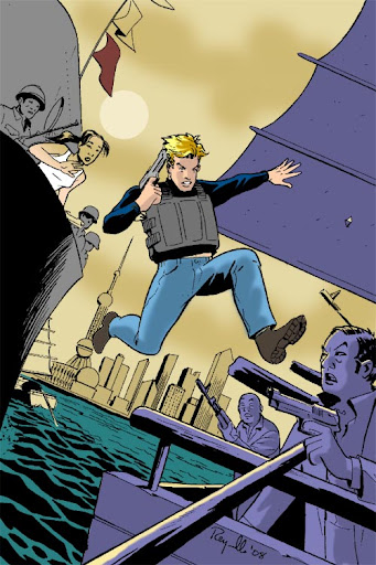
Rob Hanes Adventures #11 is now available. For an advance preview, click here
In “Rob Hanes and the Pirates," when Rob uncovers evidence of a sophisticated counterfeiting ring being run out of a rogue "axis of evil" nation, he is abducted by an old nemesis and imprisoned inside one of the world's most remote regimes.
His only hope for escape resides in an unlikely alliance with a kidnapped Asian starlet, a disgruntled military officer, and an American defector from the Cold War era!
I was attending UCLA in 1983 when American Flagg! debuted. While I can’t recall specifically what comics I was reading at the time, aside from some early black and white titles that signaled the start of the independent comics movement like Cerebus, Elfquest, and Love and Rockets, there wasn’t much in the mainstream that I can recall particularly inspired me, though I had discovered the direct market just a few years earlier.
Then along came Howard Chaykin’s American Flagg! This year marks its 25th anniversary.
It’s probably the single series which reignited my passion for comics and which showed me that comics like my own that did not solely feature superheroes in tights were a viable alternative in the new direct comics market.
While Chaykin’s aesthetic roots are firmly planted in the pulps and mainstream comics, this certainly was a series that was truly all him, which reflected his own sensibilities and views. Flagg featured a strong author’s point of view, and featured a unique blend of science fiction, satire, and mature themes. Chaykin created a rich setting environment for his near-apocalyptic tale of consumerism and the corporate state run amuck. (It also should be noted that Chaykin also considered Flagg to be a comedy.)
Of course, like all great comics, while the concept and story were outstanding, the art brought it to a whole new level. With Flagg, Chaykin’s strong sense of design came to the forefront, punctuated by his effective use of Duoshade.
Flagg was a comic-book series that I eagerly anticipated each month, and one for a long time I continually pored over for both study and inspiration.
Though the series continued for several more years after the first 12-issue story arc, Chaykin—never one to linger and always with his eye on the next project—eventually lost interest in the series and at different times during its history turned it over to other artists and writers. For the most part, my interest gradually cooled in the series as well. Nevertheless, in its first few years, Flagg completely reinvented the form for me showing how much more could be done in monthly comic-book format. Flagg still brings back terrific memories of my college days and of an exciting and inspiring time to be part of comics.
Late last month, a review was posted of Rob Hanes Adventures #11 at the Newsarama website that, for the most part, can be probably best described as "negative."
I put "negative" in quotes because the reviewer does say some positive things as well—namely, that RHA is a title he enjoys and looks forward to. Being the optimist I am, I'm always heartened whenever someone mentions to being already familiar with the series. This just happened to be an issue he found fell short of what his usual expectations.
Like many artists, I tend to be my own worst critic, so such reviews usually are not too difficult to take, especially when the comments are constructive, and given in the spirit of serious and professional criticism. In such cases, I always respect the reviewer's opinions and can acknowledge well made points. Obviously, if you put your work out there, you have to take the good with the bad. For the most part, reviewers respect the series and my goal with it to recapture the feel of the classic adventure strips in the modern day. Getting serious consideration and study is always better than receiving no regard at all.
In retrospect, I'm not sure I completely agree with the review's assertion that Rob acts recklessly/stupidly in the issue—part of the series' conceit, after all, is that he is a high-spirited newbie—but by the same token Rob does tend to conduct himself in a fairly competent manner, so I can see his point. As I mention at a comment I left at the site, the best I can do is try harder and hope the next issue is more to his liking!
In any case, under the heading of "any publicity is good publicity," I'm posting this link to the review....
One of my favorite films in recent years is Hot Fuzz, directed by Edgar Wright and starring Simon Pegg and Nick Frost, who also were involved with another cult-favorite effort, Shaun of the Dead. Though I knew Hot Fuzz was a parody of high-octane Hollywood buddy cop films, because of my preconception of it as an English movie (and mind you, foreign movies are a fairly regular staple of my movie-going diet), I was nevertheless completely taken by surprise by how slick and sophisticated a production it was, as well as funny. Discovering brilliant gems like this is what makes movie-going so worthwhile.
Just released in a deluxe DVD package is the BBC television series Spaced, an early project on which Wright, Pegg and Frost first worked together. The series played for two seasons, for a total of 14 episodes, in 1999 and 2001, and was the brainchild of Wright, Pegg and fellow actor Jessica Hynes, who also stars in the show.
Pegg and Hymes play Tim and Daisy, two slacker types who meet in the first episode after each having just ended their respective relationships. Tim is a struggling comic-book artist and Daisy is a wannabe writer/journalist. In need of fresh starts, they find an affordable flat to rent together as roommates but only can do so by posing as couple. The core cast of characters—eccentrics all, in the best English tradition—includes their heavy-drinking divorcee landlady, Marsha; Mike, Tim’s best friend from childhood, who is obsessed with guns and playing army (played by Frost in his very first acting job); Twist, Daisy’s best friend, a fashion plate; and Brian, the tortured artist who rents another flat in the house.
The show is heavy on pop culture references and incredibly self-referential, containing homages and references as varied as the Star Wars films, the Shining (and all matter of horror films), the Matrix, Grease, One Flew Over the Cuckoo’s Nest, the A-Team, and the films of John Woo. Along with its hilarious quick cuts, fantasy sequences and flashbacks, you can clearly see the beginnings of the style that would evolve into Hot Fuzz. While much of the comedy are in the characters themselves, what also distinguishes the show's work is the way it uses the conventions of genre films and direct visual homages of pop culture to heighten and punctuate the humor. Much like a DVD Easter egg, these pop culture references add another layer of subtext and hilarity to the show.
Like Hot Fuzz though, the show’s comedy and heightened reality never predominate the show or the characters: the filmmakers and the actors clearly worked to create recognizable people and situations that audiences genuinely care about. Taking advantage of the truncated British television season format, the series creates a genuinely heartfelt story and character arc within the two 7-episode seasons—much of the tension of the show is built around the complex relationship between Tim and Daisy, and the question of whether or not their relationship will go to the next level. It’s a remarkably well-done balancing act the way that the show can simultaneously feel emotionally grounded yet veer into near-surreal moments as well.
The bottom line, however, is that the show is laugh-aloud funny, and flies its geek flag proudly.
UPDATE: My family and I saw this show on Saturday, August 23, and had a grand ol' time—we even spotted Actor's Gang director Tim Robbins was spotted after the show! When I attended UCLA in the early '80s, there was a real confluence of talent in the theatre arts program. Since then many of the actors who I saw in theatre productions there have found varying level success in Hollywood. These include performers like screenwriter/director Shane Black (creator of the Lethal Weapon movie franchise), charactor actor Lee Arenberg, and actor Jack Black. Given this deep pool of talent, I developed a real appreciation for live theatre when I was at UCLA.
Also among this group was actor/director/producer Tim Robbins who, after UCLA, went on to found the Actor's Gang theatre group, many of whose productions I have seen over the years. Several years ago, the group moved to a new facility local to me in Culver City, so it's been a treat to rediscover them. (Recent productions I've seen are "Gulliver's Travels" and "Klub," the latter of which I saw when it was originally mounted back in 1992.) I've been impressed by how active they are in the local community, particularly in reaching out to youth through shows and acting campus.
One of their regular activities in this area has been free summer productions they mount for families and children. I saw last year's production, "Titus the Clownicus," a comedic adaptation of one of the bloodiest of Shakespeare's blood plays, "Titus Andronicus." It was hilarious, and like most Actor's Gang productions, edgy, with plenty of layers of comedy to entertain both children and adults.
This year's production is "King O'Leary," an adaptation of "King Lear," set during the days of California's Gold Rush. The show runs Saturdays and Sundays at 11 a.m., August 9 – 31, on the front lawn of the Actor's Gang home at the historic Ivy Substation in Culver City. (The address and directions can be found here.)
Below is a promotional video from last year's "Titus the Clownicus."
As a fan of classic comics, I’m very familiar with Hal Foster’s Prince Valiant and Foster’s enormous talent as an illustrator and his attention to detail. However, I never read the strip much—it wasn’t carried by any newspapers I read and I’ve never made an effort to pick up any of the reprints because of my focus on other strips.
A book I was interested in seeking out at the San Diego Comic-Con was Alex Raymond: His Life And Art, about the Flash Gordon and Rip Kirby artist. While seeking it out at the Bud Plant booth at San Diego, however, I came across the Prince Valiant Page by Gary Gianni, the current artist on the strip. (Gianni is only the third artist to work on the series: Foster created the strip in 1937, passed it on to his personally-chosen successor, John Cullen Murphy, in 1971, who then passed it on to Gianni in 2004. Xenozoic Tales creator Mark Schultz currently writes the script.)
While I was completely unaware that another artist had succeeded Murphy (himself a well respected comic strip artist), the samples of Gianni’s work in the book impressed me enough that I ended up picking it up instead of the Raymond book.
The Prince Valiant Page is a wonderful book. In a very simple and straightforward matter, the modest Gianni talks about the challenges and process involved in working on a syndicated strip, particularly one that requires as much work as Valiant. It’s clear he honored and appreciated the work that came before him, but he also has tried to make the strip his own. I was especially impressed by how candidly Gianni speaks candidly about his use of models, as well as reference material and “swipes.”
Perhaps because I found the book so compelling I was surprised how quickly I read it—but there are plenty of wonderful examples of Gianni’s work (roughs, original art, printed pieces, etc.) to pore over. This is a great book for any fan of Valiant or illustration in general, and certainly for aspiring artists.
Until recently, beginning with the original Superman starring Christopher Reeve, and continuing through the Spider-Man franchise and this summer’s Iron Man and Hulk movies, superhero film adaptations focused on serving up to audiences—and comic-book fans— faithful live-action recreations of their favorite comic-book characters. The franchises and their concepts usually drove these films, and getting it “right” was the primary goal. After several mis-fires and re-boots (reaching a new nadir with the ‘90s series of Batman films), Hollywood has finally shown it has both the technology and respect for the material to make superhero adaptations that are entertaining and faithful to the source material.
The Dark Knight takes this natural progression to a new level. Moreso than any with previous superhero film adaptation, in the Dark Knight, director and co-writer Christopher takes his audience to a new place by taking an existing superhero character to explore complex themes and ideas that go beyond the franchise.
Though Nolan has been rather oblique about the message of the Dark Knight (he has acknowledged it can partly be seen as a commentary on the blowback the U.S. has experienced in recent years due to its foreign policy escapades), one of the issues the film addresses—which the characters in the film explicitly raise themselves—is whether the Batman (Christian Bale) is a cure or a symptom.
While the Batman’s intentions to serve as his city’s guardian are honorable, in the film his presence and methods seemingly make things worse by ratcheting up the violence, inspiring copycats who get in the line of fire, and attracting new levels of villainy, as embodied by the Joker. As a result there are plenty of casualties in the film, many of them innocent victims. And at various points, the Batman’s faithful lieutenants—his valet Alfred (Michael Caine) and his technology guru Lucious Fox (Morgan Freeman)—openly question the Batman’s tactics and whether he may be partly to blame for what has occurred.
Without giving too much away, regardless of whether he’s to blame or not, or indeed making a different (the film ultimately doesn’t answer this question), it’s telling that, at the end of the film, the Batman literally and symbolically assumes full responsibility for what has transpired. And like the archetypal Western, after having cleanses the city, he leaves town a hunted man, alone.
Like Batman Begins, this re-boot’s first installment, the Batman and his story arc are central to the Dark Knight. And although the secondary cast and, particularly, the villains are strong and colorful, unlike the previous Batman series, they never threaten to overshadow the film, and they always serve to advance the film’s main story and central themes.
Heath Ledger’s performance as the Joker has justifiably received universal acclaim (and is nicely analyzed here), so there’s no need for me to add to to the praise. But it needs to be noted that Ledger (and Nolan) have done an extraordinary job in successfully re-imagining such an iconic figure. The Joker in this film is faithful to the very chilling first appearances of the character in the 1930s and his more recent re-inventions in graphic novels like Alan Moore and Brian Bolland’s “The Killing Joke,” while also being completely new and fresh. It will be interesting to see how Ledger’s interpretation filters down to the comic book series.
Morgan Freeman, Michael Caine, Gary Oldman (Jim Gordon), and especially Maggie Gyllenhall (Rachel Dawes) and Aaron Eckhard (Harvey Dent/Two Face) all are given meaty roles even if they have limited screentime. And one should not overlook the fine performance of Christian Bale in the lead role, who inhabits the character with great respect, conviction and vulnerability.
It’s probably too early to call the Dark Knight the “best comic book movie ever”—certainly not with Watchmen on the horizon in 2009— but it’s among the most ambitious, mature and sophisticated. Plus, the increasing sophistication and varied textures of superhero films—ranging from summer popcorn flicks like the Spider-Man films and Iron Man to now darker fare like Dark Knight and Watchmen—doesn’t easily lend itself anymore to judging these movies with the same broad measure. Regardless, with the Dark Knight’s complex storyline and multiple rich character arcs, and the reviews that have acknowledged the film’s ambition, the superhero film has truly grown up.
One final comment: I had the fortune to see it in Imax format. Six scenes were filmed in the oversize, crystal-clear Imax filmstock. When the Imax sequences initiate, the film takes up the entire Imax screen, then reverts back afterwards. It is quite impressive, without being distracting or taking you out of the movie.
NOTE: This was originally posted at the WCG Comics website and has been moved and archived to this blog on February 2020.
Click here to skip this report and go straight to my photogallery slideshow for the 2008 San Diego Comic-Con International. Short video clips from the show are available here.
Trying to get your arms around a show as fast-moving, varied, and all-encompassing as the San Diego Comic-Con is undoubtedly a fool’s errand, but below is my attempt to summarize the show from my tiny vantage point as a small press exhibitor.
First, thanks to everyone who stopped by my booth. This was my 11th appearance at Comic-Con as an exhibitor. I’m delighted that people continue to enjoy and follow the series—a few fans pointedly told me that mine is the first booth they visit when they attend the convention. It also was great to hear that people were aware of my appearance in advance through my website and blog, as well as through online plugs like Heidi MacDonald’s webcolumn, The Beat.
It's a great experience that new fans continue to discover the series. Very often, people are first struck by the art, become sold by the concept, and then pick up a sample issue or two, or a sample pack. Many even return before the convention ends to pick up the remaining issues after they’ve had a chance to sample the series! Other times, people have needed little persuading to simply pick up the entire series at once, causing me to remark that I wish selling the series was always so easy!
Still, sales overall were slightly lower than last year (which ranked among my best ever). This seemed to be the case, anecdotally, for many of the small press exhibitors I spoke with. I attribute this in part to the sheer overwhelming scale of the show. With so many comics, movies, television shows, toys, games, and round-the-clock programming competing for people’s attention and hard-earned cash, small exhibitors like myself are the proverbial needle in the haystack, making it difficult for new readers to take everything in and process it, and difficult for even those who should be my target audience to even come across me and my work.
Even after all these years, readers discover me at the show for the first time by accident, even if they have attended for many years. While some will say they vaguely recall hearing about my book online or in a review, others sometimes say they picked up issues many years ago but didn’t realize I was still publishing!
Figuring out how to cut through the noise (both during the show and the other 361 days of the year!) will be my goal in the coming year.
In order to avoid rush hour traffic, it’s become my habit to leave Los Angeles for the show very early in the morning in order to set up for the “Preview Night," which is traditionally held from 6 to 9 p.m. the Wednesday evening before Comic-Con’s official opens on Thursday. This year I left L.A. at approximately 4:30 a.m. and arrived in San Diego at 6:20 a.m.! (It’s about a 130 mile drive.) For the third year in a row, I ran into 1995 NCS Reuben Award winner and fellow CAPS member Sergio Aragones upon my arrival at the convention center. We discovered we both employ identical strategies for setting up and departing the show. I guess great minds think alike!
My brother, who always attends and is a great help, flew in on an early morning flight to help me set up my booth. He was there by 8:30 a.m., but we were delayed by the fact that my section of the small press area was not yet set up because it's a staging area for the convention’s workers who are responsible for setting up the convention hall and delivering pallets of goods throughout the floor. (At this hour the floor is teeming with workers and forklifts, and legally off-limits to minors!) In their rush, they also forgot to install the curtains behind our booths, so the booths in my section looked a bit less dressed than usual.
As noted at my blog, I designed a new booth banner and display stand because last year’s banner, which was new last year, required too much jerry-rigging. The new display went up easily, required little sweat and effort, and actually is taller than last year’s display. So it looks like I have a keeper! (The art to the booth banner is pictures at left. Click on it to see it full size.)
After finally assembling the booth in quick order, my brother and I went into San Diego’s Gaslamp District downtown for lunch, just across the street from the convention center. I then parked my car at the hotel, picked up my family’s complimentary guest badges at the convention center, then met and checked in my wife and two children at the hotel when they arrived mid-afternoon. This was the first time they came down on the Wednesday before the show. In past years, they usually drove down the first day of the show, Thursday.
This turned out to be fortuitous. In one of the biggest snafus of the show—though it was through no fault of Comic-Con—there was a major accident early Thursday morning, the first official day at the show, on Interstate 5. The I-5 is the major north-south freeway artery that connects San Diego to L.A. and the rest of the state. As a result, rush hour and Comic-Con traffic became snarled and bottlenecked into a single lane into San Diego. People I spoke with at the show (including cousins of mine who came down and surprised me), were trapped in their car from 5 to 7 hours for what normally is a 2 to 2.5 hour drive!! Thus, by coming down a day earlier than usual, my family saved themselves a lot of grief and frustration. (Better yet, I didn’t have to leave my booth in the middle of the show to help them check in at the hotel!)
The properties that received the biggest buzz at the convention were the upcoming Watchmen film adaptation (whose movie trailer debuted right before the show) and, to a slightly lesser extent, the upcoming Spirit movie, as adapted and written by cartoonist-turned-film auteur Frank Miller. (A video link to the Spirit movie teaser is provided at right.) The presentations for both films were held in the 5000-seat Hall H on Friday, which strangely made the rest of the show anticlimactic in some ways.
As always, there were many celebrity cameos at the show, with people like Kevin Spacey, Samuel L. Jackson, Paris Hilton, and Keanu Reeves making appearances. I personally spotted on the floor Simon Pegg (Shaun of the Dead and Hot Fuzz, and Scotty in the upcoming Star Trek relaunch); Breckin Meyer; Robert Culp; William Katt; actor-comedian Jay Johnston (walking rather incognito and sporting a bushy mustache—he smiled when he saw my daughter in her Batgirl outfit); and several cast members of NBC’s “The Office” television show, who appeared on a “Writers of the ‘The Office’” panel: Mindy Kaling, B.J. Novak, and Melora Hardin. (Pegg understandably declined to take a photo on the floor requested by a fan because of the fear it would set off a frenzy on the floor. Novak similarly declined my own request as he walked past my booth, though he did thank me when I said, “Love the show!”)
Sergio Aragones
The Comic-Con also is a place for networking and business-dealing, and I must admit I engaged in a little of that. However, compared to past years, I saw fewer professional friends and colleagues, something I again attribute to the size of the show since there is so much going on that demand people's attention. Some fellow pros I saw included, as mentioned above, Sergio Aragones (pictured at left, who I visited with my two children); Batton Lash; and Len Wein.
Some relaxing moments I enjoyed were the late night dinners after the show with friends and family, often at fine restaurants not far from from the more crowded eateries. Once again, we varied our cuisine each night, having Indian, Japanese and Afghan food on different nights! One night was set aside for a poolside pizza party with some old friends by one of the nicer hotels, watching the kids enjoy themselves. (My family, without me, also went to LegoLand on Friday.)
As usual, since my wife and I had our two young children with us, I had little time for extracurricular or evening program and activities. But I did get plenty of good firsthand reports from friends and family who got to take advantage of the diverse programming. On the plus side is that I was in bed at a relatively reasonable hour and fairly fresh and rested for the next day's efforts!
Reflecting the ongoing evolution of Comic-Con, many of the projects featured at the convention had very little, if any, connection to comics or even the broader “geek” ethos. Though people in recent years have expressed concern about this continuing trend, the incursion and creeping dominance of the entertainment industry at Comic-Con seemed more apparent than ever this year. The L.A. Times (here and here) and other outlets and observers —including bloggers and commentators like Heidi MacDonald—have run stories noting that comics seem relegated to the background at its own party.
I’ve long maintained that as long there are other comic-book conventions around the country that possess the aura and flavor of the Comic-Con's early days as a showcase for just comics—and there are—I think it’s fine and, I must admit, validating to have a show like this that shines such a huge public spotlight on the field.
This year, however, I saw the flip side of the coin. As I mentioned in my blog prior to the show, Comic-Con attracts people who I suspect simply want to be part of the spectacle but have very little (if any) interest in comics at all.
Though I'm not sure I completely agree, respected comic-book retailer Chuck Rozanski goes as far to say that he feels “greed” now drives many attendees and that the focus on freebies and Comic-Con exclusives are a recipe for disaster. He also makes the interesting distinction that because of the shift in Comic-Con's focus, it can no longer claim to be North America’s biggest comic-book convention since comic-books are so secondary.
Nevertheless, Comic-Con is a "big tent" event that accommodates a wide range of interests. An NPR reporter, as quoted by CBG editor Maggie Thompson at her blog put it best: "Comic-Con is whatever you want to make it." So if all you’re interested in is comic-books, you can still find plenty of gems on the floor. (For myself, the First Second Books booth of its line of graphic novels was a delightful discovery.) Admittedly, the convention’s frenzied, circus-like environment makes it difficult to browse in a leisurely fashion, but you'll certainly find the full range of comicdom represented there under one roof.
But it will be interesting to see whether the organizers decide to draw a line in the sand to protect the heart and soul of the event, or instead allow the entertainment juggernaut to slowly take over more of the show in pursuit of growth and size. Given the attention and money they bring, one can see the allure of going over to the dark side. (Already one major lower-tier publisher that has emerged strong in recent years, IDW Publishing, has made noises about not returning to Comic-Con, despite the fact that they actually are based in San Diego and local to the show. IDW's president, Ted Adams, speaks thoughtfully on this subject, and seems to focus on whether the marketing value is worth the expense and time away from production. The varied reactions to his public ruminations can be found here.)
As mentioned above, comics retailer Chuck Rozanski—no doubt expressing the private thoughts of many of his peers who remember the Comic-Con from its early days—spoke frankly about the things he thought was wrong with the current show. By the same token, Rozanski also acknowledged that, “Upon reflection, I keep coming back to the fact that I love this convention so much that I would miss it beyond all words if I did not come each year…. After 36 consecutive years of exhibiting here, this convention has become ingrained into my spirit and soul.”
That pretty much sums up my own feelings. I grew up professionally with Comic-Con, and have established a presence at the event. It’s also in my own backyard here in California which is also why I attend. Rumors have emerged in recent years that Comic-Con is considering other venues to accommodate its continued growth. L.A., Anaheim, and Las Vegas are usually mentioned as possible new locations. While I probably would still attend and exhibit if the show was in L.A. or Anaheim given their proximity to me, I doubt I’d go to the show as regularly if it were in Vegas or any other place. At that point it would cease to be Comic-Con for me.
Click here for my photogallery slideshow for the 2008 Comic-Con International. Video clips are available here.
Fun Facts:
Soundtrack for this year's drive to and from San Diego: Duffy’s “Rockferry” (after several years of Ben Folds Fives’ “Whatever and Ever Amen” and William Shatner’s “Has Been”)
Fun Swag: Barry Allen Flash ring and Attack of the Clones button
Purchases: Alex Toth: Edge of Genius (Vol. 1), Pure Imagination Publishing; The Prince Valiant Page by Gary Gianni; Studio Space by Joel Meadows and Gary Marshall; Comics Foundry #1 and 2
For additional coverage, visit the following sites:
I've just returned from this year's San Diego Comic-Con International, and it was another crowded and frenzied affair! I met plenty of fans both old and new, and sold a lot of back issues and copies of my newest issue, Rob Hanes Adventures #11.
I plan to post my usual report and photogallery of the show shortly. In the meantime, below are some photos and comments posted live from the show...
I have little time to report anything substantive, other than to say that this show will no doubt be seen as another huge monster success, in terms of the number of attendees and the frenzied coverage it will receive. As always, many comic-book companies and entertainment companies have waited for the Comic-Con to make many major announcements. It's only Friday and I already feel tapped—and tomorrow is Saturday, traditionally the busiest and craziest day of the convention!
Anticipation for the Watchmen movie seems to be the main buzz of the show. On Friday (July 25), a packed audience was treated to the preview and a panel discussion with the director and the movie's stars. Cartoonist and new director Frank Miller was also on hand to present a extended clips from his upcoming Spirit film. (All this was just reported to me, of course, since I worked at my booth most of the day!)
Actors/celebs I spotted on the floor include Simon Pegg, Robert Culp, William Katt, Lou Ferrigno, Breckin Meyer, and, from The Office television show, stars Mindy Kaling, B.J Novak, and Melora Hardin. (Kevin Spacey, Keanu Reeves and Paris Hilton also have made appearances here.)
The other big news—though peripherally related to the convention—was the closure of the Interstate 5 freeway into San Diego on the first day of the show (Thursday, July 25), due to a car accident that occurred at 5 a.m. People I spoke with who drove in to the show from various points in L.A. got stuck in their cars for 5 to 7 hours, compared to the 2 it took me to drive down early Wednesay morning. My wife and children usually come down Thursday—a day after me—but this year they fortunately came down Wednesday afternoon and saved themselves a lot of grief and frustration.
Anyway, below are some preliminary pics from the show (you can click on them to see them full-size and in more detail).
With this head of thick curls, my wife could not resist dressing up our little boy as a hobbit...
Beam me up, Scotty!
Imperial stormtroopers
People dressed as Indiana Jones are a dime a dozen at the convention, but I just had to take a pic of this pair who came as Indy Jr. and Sr.
The batcycle...
Striking a pose...
Traffic at the convention center at 8 in the morning, hours before the doors officially open!

 As far as I’m concerned, we’re living in the true golden age of comics. In addition to comics-based properties dominating movie grosses, many classic comics and comic strips are being collected in their entirety in quality editions for posterity, and books both for casual readers and serious scholars are plentily available about the history and phenomenon of the medium and for those interested in comics-related careers.
 by Martin Sheridan (1941, reissued 1973)