It’s a tribute to the artist’s enormous influence and talent that Noel Sickles, who worked exclusively as a cartoonist only from about 1933 to 1936, continues to be remembered and honored in the comics industry. Along with cartoonist Milton Caniff, creator of Terry and the Pirates and Steve Canyon, Sickles in his brief time in the industry is credited with creating and subsequently inspiring a whole new style of cartooning—often referred to as the “chiaroscuro school”—which used heavy blacks to create a sense of dramatic mood and atmosphere, as well as a documentary effect, on the comics page.
Further cementing his legacy is a hefty, comprehensive, and beautifully designed oversized artbook devoted to the artist, Scorchy Smith and the Art of Noel Sickles, by Dean Mullaney. Reportedly begun as vehicle to reprint the artist’s full run on Scorchy Smith—an aviation/soldier of fortune daily adventure comic strip inspired by Charles Lindbergh—the labor of love soon evolved into a serious retrospective into the artist’s life and career.
While Sickles would regardless always have been remembered for his pioneering work, his place in comics history was partly ensured by Caniff (who I’ve blogged and written about extensively: see here and here). Both from Ohio, the two young men met at the start of their careers at the Ohio Dispatch newspaper art bullpen (both attended Ohio State simultaneously for a time) and soon became close personal friends as well as studio mates. Caniff was a skilled networker and self-promoter, but generous as well. Indeed, in the midst of the Depression, it was Caniff who found Sickles a job at the Associated Press shortly after he had been hired there, which eventually led to Sickles’ assignment on Scorchy Smith. But Caniff never hesitated to credit Sickles for inventing the style that Caniff subsequently picked up, developed further and turned into his signature style.
Sickles partly developed the style to speed up production on Scorchy Smith since it allowed him to slap down blacks very quickly. But he also did so out of boredom and experimentation. Like another Sickles/Caniff disciple, Alex Toth, Sickles was notoriously restless, as well as incredibly versatile. (Like Toth, Sickles was an "artist's artist.") Storywriting Smith never really held much interest for him; Caniff often scripted the strip in advance for him while Sickles occasionally lent a hand on his studio partner’s strips. But even in his short time on his strip, you can see Sickles using a whole range of styles, from the chiaroscuro look to one with heavy cross hatching.
Given this restlessness, it seemed inevitable that Sickles would move on. And indeed he did, becoming a successful and respected commercial illustrator, which Mullaney’s book covers comprehensively. Sickles’ cartooning background, however, clearly continued to serve him well. A review of his work in the new biography shows that his art never looked artificial or labored, but rather incredibly spontaneous and naturalistic. And each piece always told a story—indeed, most of his work seemed to be for fiction pieces or were presented as reportage, rather than classic commercial illustration.
Credits: Many of the images featured here from Scorchy Smith and the Art of Noel Sickles are from commercial artist Leif Peng’s “Today’s Inspiration” blog. Leif has posted extensive samples of Sickles’s work featured in the book here.
Pages
Thursday, September 25, 2008
Tuesday, September 16, 2008
Je m'appelle Bonisseur de La Bath—Hubert Bonisseur de la Bath
I’ve always been a sucker for classic Bond films, as well as films and music that capture the spirit of the early Space Age '60s era.
Tipped off by a capsule review in Entertainment Weekly, last May I had the pleasure to discover such a film, from France no less, entitled, OSS 117: Le Caire Nid d’Espion (Cairo, Nest of Spies) at a local upscale arthouse movie theater (the Landmark in Los Angeles). The official site for the film can be found here. The film is scheduled for release at the end of this month—above is the films' trailer.
As one can see from the teaser, OSS 117 is essentially a Bond parody film—in French of course— set in 1955, that authentically captures the genre and era very convincingly down to the credit sequence, the music, the cinematography, art direction, costuming, and primitive special effects, such as rear projection during driving sequences. Apparently, OSS 117 is based on a series of novels, that were made into actual spy films in France during the 1950s and ‘60s (predating Ian Fleming's Bond books!), but here it’s been updated as a comedic parody of the genre.
While the film isn’t quite as polished as your standard Hollywood fare, I enjoyed OSS 117 quite a bit, and found it very funny. I sometimes found myself on the verge of tears laughing. It helps, of course, that I watched the film with a receptive audience at an art house movie theater that provided a laugh track for much of the film.
The title character, whose codename is OSS 117 (the character's given name is Hubert Bonisseur de La Bath), is not quite as clueless as Maxwell Smart or Inspector Clouseau (though he's close), and the movie is played just slightly straighter and less-over-the top than those films. The film is definitely more authentic-looking than the Austin Powers movie, and less self-conscious or self-referential.
Some of the humor in the movie stems from the lead character being ignorant of Middle East culture and religion, so he keeps inadvertantly insulting Arabs throughout the film. As this suggests, the archaic views of Western colonialism from the era are played up for laughs. As an example, at the end of the movie when the case ends, OSS 117 predicts that the Middle East will now enjoy peace for centuries. But there also is plenty of lowbrow and double entendre humor.
The film is helped by a terrific cast, particularly lead actor Jean Dujardin, who apparently is a well known comedian in France. Dujardin manages to capture much of Sean Connery’s early 007 look and signature moves very well.
While I'm not sure everyone will get the joke, if you're comfortable with foreign films and enjoy the "space age" design of the '60s (as seen in TV shows like Mad Men and films like Catch Me If You Can), you may get a kick out of this.
Labels:
Entertainment,
Films,
Movies,
OSS 117,
Reviews
Tuesday, September 9, 2008
SHOP TALK: Google SketchUp
Like a lot of cartoonists, I’ve gradually embraced the digital revolution in varying degrees. Being the lazy bum I am, I’m always interested in making my work easier. However, I’ve also always made a point to only adopt methods that don’t detract from the overall quality of the work, or call attention to itself by clearly looking like it was done on a computer. The best examples are my transition to using Photoshop to emulate classic halftone screens, and CorelDraw for my lettering and balloons (which I blogged about here). Again, the priority for me was to ensure that readers didn’t notice any change in the work, and to add other effects gradually and subtly.
At the 2007 San Diego Comic-Con, a well-known industry pro who has been an acquaintance for many years turned me on to Google SketchUp, a 3D modeling program available as a free download. Only recently, however, did I begin to take baby steps with it, and I must admit I can anticipate it becoming a more regular part of my artist's toolbox.
The program allows users to build and edit 3D models that can then be rotated and viewed at any angle. The model can then be combined with other models, and saved, downloaded and printed in a variety of usable formats. (There are also plenty of filters and features to turn it into a wireframe drawing, or to make it look as photorealistic as possible.) Even better, thanks to the generosity of the online community, there already exists an extensive database archive of objects available for download and customization. As any artist who has struggled with getting the angle just right of a gun, a chair, a staircase, an automobile, an airplane, or even a building or cityscape knows, the applications of such a program is mind-boggling.
I’ve never used a 3D program before, so have no point of comparison for it. But the program is fairly intuitive, though of course once you begin getting more ambitious, you’ll no doubt need to delve into the manual.
I first used the program for a shot of an airplane in an upcoming story. I found a generic plane in SketchUp's online library, rotated it to the right angle, saved it as a TIFF, then used a lightboard to bring it into the finished art.
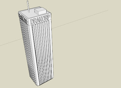
My next project was a bit more ambitious. A fictitious building in New York City, the Drakorp Building, which is the headquarters for the title character of my comic-book series, Rob Hanes Adventures, occasionally appears in the book. Initially, I had found a generic skyscraper model in SketchUp's library. However, given the distinctive look of the Drakorp building, I thought it might be worth it to take the time to build a 3D model of the building that I could then always have on file to use whenever I needed it.
Though it required some fiddling and more learning about the program, I actually built the model from scratch in just a few hours. You can see the model in its entirety in the image at the top of this post. It's actually a fairly simple, straightforward model, especially since each side is identical. The only part that turned out to be a challenge was cutting and pasting each side of the building with the window slat features down the structure's full length intact. Cutting and pasting in a 3D space turned out initially to be a bit tricky to figure out, but I finally got it to work.
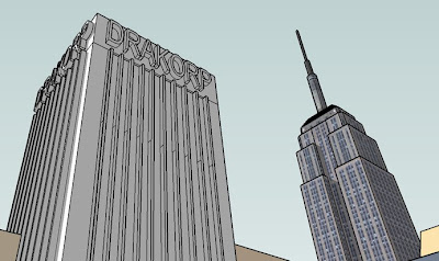
In addition, I decided it might also be a good idea to place the model within a larger city environment to create atmosphere for the structure whenever I used it. After finding a generic cityscape and integrating my Drakorp building model into it, I also imported into the space a completed model I found online of the Empire State Building. (See below for a shot of the final model at a dramatic angle, with the Empire State Building in the background.)
One thing I know for sure is that the next time I need to integrate a stairwell into a story, I will be using SketchUp!
Labels:
cartooning,
Drawing Comics,
Google Sketchup,
Shop Talk
Issue 11 Now Available!
Rob Hanes Adventures #11 is now available. For an advance preview, click here
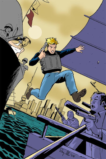
In “Rob Hanes and the Pirates," when Rob uncovers evidence of a sophisticated counterfeiting ring being run out of a rogue "axis of evil" nation, he is abducted by an old nemesis and imprisoned inside one of the world's most remote regimes.
His only hope for escape resides in an unlikely alliance with a kidnapped Asian starlet, a disgruntled military officer, and an American defector from the Cold War era!
Labels:
PRESS RELEASES,
Rob Hanes Adventures,
WCG Comics
Saturday, September 6, 2008
A LOOK BACK: American Flagg!
I was attending UCLA in 1983 when American Flagg! debuted. While I can’t recall specifically what comics I was reading at the time, aside from some early black and white titles that signaled the start of the independent comics movement like Cerebus, Elfquest, and Love and Rockets, there wasn’t much in the mainstream that I can recall particularly inspired me, though I had discovered the direct market just a few years earlier.
Then along came Howard Chaykin’s American Flagg! This year marks its 25th anniversary.
It’s probably the single series which reignited my passion for comics and which showed me that comics like my own that did not solely feature superheroes in tights were a viable alternative in the new direct comics market.
While Chaykin’s aesthetic roots are firmly planted in the pulps and mainstream comics, this certainly was a series that was truly all him, which reflected his own sensibilities and views. Flagg featured a strong author’s point of view, and featured a unique blend of science fiction, satire, and mature themes. Chaykin created a rich setting environment for his near-apocalyptic tale of consumerism and the corporate state run amuck. (It also should be noted that Chaykin also considered Flagg to be a comedy.)
Of course, like all great comics, while the concept and story were outstanding, the art brought it to a whole new level. With Flagg, Chaykin’s strong sense of design came to the forefront, punctuated by his effective use of Duoshade.
Flagg was a comic-book series that I eagerly anticipated each month, and one for a long time I continually pored over for both study and inspiration.
Though the series continued for several more years after the first 12-issue story arc, Chaykin—never one to linger and always with his eye on the next project—eventually lost interest in the series and at different times during its history turned it over to other artists and writers. For the most part, my interest gradually cooled in the series as well. Nevertheless, in its first few years, Flagg completely reinvented the form for me showing how much more could be done in monthly comic-book format. Flagg still brings back terrific memories of my college days and of an exciting and inspiring time to be part of comics.
Labels:
A Look Back,
American Flagg,
Comics,
Comics Industry,
History of Comics
Wednesday, September 3, 2008
Taking the Good with the Bad
Late last month, a review was posted of Rob Hanes Adventures #11 at the Newsarama website that, for the most part, can be probably best described as "negative."
I put "negative" in quotes because the reviewer does say some positive things as well—namely, that RHA is a title he enjoys and looks forward to. Being the optimist I am, I'm always heartened whenever someone mentions to being already familiar with the series. This just happened to be an issue he found fell short of what his usual expectations.
Like many artists, I tend to be my own worst critic, so such reviews usually are not too difficult to take, especially when the comments are constructive, and given in the spirit of serious and professional criticism. In such cases, I always respect the reviewer's opinions and can acknowledge well made points. Obviously, if you put your work out there, you have to take the good with the bad. For the most part, reviewers respect the series and my goal with it to recapture the feel of the classic adventure strips in the modern day. Getting serious consideration and study is always better than receiving no regard at all.
In retrospect, I'm not sure I completely agree with the review's assertion that Rob acts recklessly/stupidly in the issue—part of the series' conceit, after all, is that he is a high-spirited newbie—but by the same token Rob does tend to conduct himself in a fairly competent manner, so I can see his point. As I mention at a comment I left at the site, the best I can do is try harder and hope the next issue is more to his liking!
In any case, under the heading of "any publicity is good publicity," I'm posting this link to the review....
Labels:
Reviews,
Rob Hanes Adventures
Subscribe to:
Posts (Atom)