Pages
Monday, January 28, 2008
SHOP TALK: Brush update
In a past post, I mentioned how I’ve been experimenting with brush pens. This came about after experiencing a bit of “artist’s block,” which I attributed partly to dissatisfaction with my own brushwork, as well as to the declining quality of brushes I have been noticing over the years. Though I generally like working with markers, I don’t find them conducive to finished work. Desperate to shake things up, I decided to test a few out, most notably the Faber-Castell brush pen.
Although I’m still using the brush pens, the regular brush has remained in my stable of inking tools. The brush has a lightness of touch and a finesse a brush pen can’t capture. Having said that, the brush has become more of an “end-finisher”—I’m using the brush pen for more bolder linework, to fill in blacks in tight places, and for some of the more broader brushstrokes (like folds in clothes), but after some trial and error, the brush is still my tool-of-choice for most of my outline work (particularly figures).
I just wished they’d make brushes that kept their points better!!
Thursday, January 24, 2008
A New Stereophonic Sound Spectacular
Since the first music clip I posted was a Beatles tribute band from Japan, I thought I’d loosely go along the same lines with these videos of Pizzicato Five. P5 is a Japanese band that Wikipedia describes as being known for its “eclectic and energetic compositions that often sound like ‘new’ releases from the late 1960s hipster scene.”
I guess this is as good a description as any, but the bottom line is that I love the sound of ‘60s lounge/pop (Burt Bacharach probably is one of the leading proponents of that category), which explains why I got hooked on P5. (A compilation CD that was their third release in the U.S.—“The Sound of Music of Pizzicato Five”—is on heavy rotation on my CD player.) Their catchphrase, “A New Stereophonic Sound Spectacular,” perfectly captures their sound and attitude.
P5 proved to be the entryway for me into the Japanese pop scene (J-pop), which I'm sure will be the subject of another blog entry in the future. Meanwhile, enjoy….
Labels:
Music,
Pizzicato Five
Monday, January 21, 2008
SHOP TALK: Using a computer to produce comics
Like a lot of cartoonists, I’ve become more dependent on computers to produce comics. Though I remain “old school” in many ways where Bristol board, photo-blue pencil, and an ink pen and brush are still essential tools of my trade, the computer has also now become an increasingly indispensable part of the process for me.
I adopted Photoshop early on for coloring my comic-book covers, of course, primarily because it's the industry standard, and comics colored any other way look amateurish and unprofessional—and the first impression a reader gets from your title is important. However, over the past few years, I’ve really ramped up my use of digital effects in my work.

The first two major priorities and eventual breakthroughs in this regard were learning how to emulate zipatone in Photoshop, and figuring out how to digitally letter and draw word balloons with CorelDraw. (Zipatone is a transparent adhesive sheet that creates the classic shaded dot pattern, as seen at right.) Both took quite a bit of patience and trial and error, but my efforts finally have paid off.
It’s a treat now to gray tone my art at will, without being limited by the number of zipatone sheets I have on hand and their cost, which previously required me to use my precious supply sparingly. Though for the most part I continue to use a flat pattern, I now have the freedom to add second darker tones to add further depth, and gradients. (As in any such tool, overuse of such effects risks making the art look too busy and distracting.) In addition, since the zipatone patterns, lettering and word balloons are no longer on the original art, my pages look "cleaner," giving me the freedom to more precisely place word balloons and adapt the art for other needs in the future, such as for color and advertisements.
(A detailed technical description of the process of creating the zipatone effect in Photoshop has been posted here.)
I should note that one of my priorities when I adopted these techniques was to ensure that it did not compromise the quality of the final product, and that it was transparent to readers—in other words, that the final work looked the same as before, and it wouldn’t be obvious that a computer was now being used. (A good example of this was to slightly skew the word balloons pages so that they are not perfectly round or oval, and look organic and hand-drawn.)
One of my earliest experiments was to drop into a background a scanned photo of an aerial view of a cityscape in issue 10 of Rob Hanes Adventures, as seen below (btw, all the lettering and sound effects were also done on computer as well, using CorelDraw):
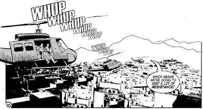
This, of course, is one of the oldest tricks in the field, with cartoonists as diverse as Will Eisner and Jack Kirby occasionally integrating photographs to some extent into their work.
More recently, I’ve gotten a little more creative in relying more on these digital tools to assist me, borne out of the desire to avoid the drudgery of some of the more tedious aspects of drawing.
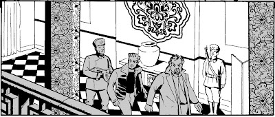
A couple of examples can be seen below, both from the issue (#11) I'm currently working on. In the first, I dropped in a tiled floor in the panel. In the past, I would have set up 2-point perspective vanishing points and painstakingly drawn in the pattern in accordance with the grid.
Taking advantage of my digital tools, however, I drew a checkerboard pattern in CorelDraw, then used the software’s perspective/skew capabilities to angle it and place it in the panel at the appropriate perspective, using an imported version of the art to position it correctly. (The file is then saved as an EPS file, imported into its own layer in Photoshop on top of the final digital version of the page, then cropped to fit into the space around the foreground elements of the picture. You'll notice that the graytones on these examples are continuous gray washes, not a zipatone pattern. This is what the art looks like before it is bitmapped, which converts the graytones into a pattern.)
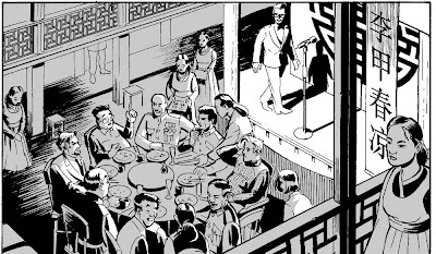
I used a similar approach for the railing design on the balcony in the upper left part of the drawing below. The railing pattern was laid out in CorelDraw, then skewed to fit the art at the correct perspective angle. (The Chinese characters on the ceiling banner and the design on the backdrop of the stage were also dropped in with a computer. The design behind the stage is a piece of clipart.)
Other advantages to working digitally include the ability to re-draw panels (or even parts of panels, such as a headshot), and cutting and pasting it on top of the original scan digitally; similarly, if I’m not sure of a certain effect or a placement of black, I sometimes leave it blank and do it on the computer. If I’m not happy with the results, it is very easy to erase or change it.
Compared to some artists, I’m still on the early curve of taking full advantage of the full capabilities of this digital tool. Some artists, for example, are now entirely penciling and inking digitally, eschewing India ink entirely; others use a variety of programs, like Sketchup and Poser, to help them draw backgrounds and props that are in perfect perspective.
Ultimately, in cartooning and most arts, it’s not the tools that matter, it’s the final product, limited only by the skill and ingenuity of the artist. At the end of the day, a human being must put down those lines, and those patterns—digital or not. Regardless, it’s a treat for someone as lazy as me to have these tools at my disposal to help cut some corners on the production end without sacrificing the quality of the final output.
Labels:
art,
Comics,
Drawing Comics,
Shop Talk,
zipatone
Thursday, January 17, 2008
Welcome to my life's soundtracks....
Anyone who glances at my musical interests will notice I have pretty broad tastes, ranging from the Beatles, the Rat Pack, jazz, j-pop, '60s lounge, rock, showtunes, and movie soundtracks. I've also got a pretty high tolerance for kitsch—I must admit I sometimes genuinely enjoy it for what it is, not necessarily because "it's so bad it's good."
With that in mind, I decided to start mixing things up in this blog by interspersing my commentaries with some fun music clips for your listening enjoyment.
Since the Beatles has always been my favorite band of all time (I discovered them when I was about 7 or 8), I thought it appropriate to kick things off with this clip of a Japanese Beatles tribute band.
When my wife and I went to Tokyo for our honeymoon back in 2000, one of our most memorable nights was at a small club that specialized in Beatles tribute bands. It was a kick to listen to the bandmembers banter between songs in Japanese (which we don't understand), then launch into a note-and-phonetic-perfect performance of a Beatles song. (The audience was allowed to submit requests, and we requested one of my personal all-time favorite Beatles' songs, "And Your Bird Can Sing.")
Anyhoo, without any further ado... "The BeaTrips!" (For the real thing and a bonus video, go to my MySpace page, under musical interests.)
Sunday, January 13, 2008
The Birth of Geek Chic
One of our country’s central mythologies is that the U.S. is a land of opportunity—a meritocracy where anyone can succeed with the requisite pluck, talent and ambition. The dark underbelly to this axiom, however, is that many of America’s earliest success stories were borne out of shady deals and backroom activities that, at best, could be described as exploitative and unscrupulous, and, at worst, criminal. The late 19th and early 20th centuries were the age of the robber barons who often bought their way into respectability and cleansed their stories and backgrounds before becoming part of the mainstream and ruling elite.
Gerard Jones’ 2004 book, Men of Tomorrow: Geeks, Gangsters, and the Birth of the Comic Book, tells this oft-told tale of new wealth and exploitation in the context of the comic-book industry. It’s an engrossing tale full of colorful and shady characters, as well as naifs, who together gave rise to geek culture and the modern-day entertainment industrial complex.
While there are many colorful players in this story about the messy birth of the comic-book industry, the main characters who form the spine of Jones’ book are, on one side, Harry Donenfeld and Jack Liebowitz, who essentially engineered the birth of the comic-book/superhero industry through DC Comics, which eventually morphed into the media and entertainment behemoth known today as Time Warner; and, on the other, the hard-luck Jerry Siegel and Joe Shuster, the creators of Superman who essentially were swindled out of the ownership and any reasonable share of their iconic character’s lucrative earnings.
Siegel and Shuster are portrayed as the first prototypes of the geek ethos that would not truly come into its own until the end of the century. Socially awkward and seemingly developmentally arrested, both found comfort and safety in pop culture, and particularly comics, the pulps and science fiction. Siegel and Shuster were among the first members of the nascent science fiction fandom movement that emerged during the 1930s, which initially was fueled primarily by the pulps. Siegel even was among the first to publish a fanzine.
In contrast, Donenfeld and Liebowitz were hardscrabble, street-smart Jewish immigrants who constantly reinvented themselves as they scrambled to find ways to make a buck and a longterm way out of their tough tenement beginnings. Indeed, most of the field’s first generation of cartoonists—Will Eisner, Jack Kirby, Bob Kane, Will Elder, Harvey Kurtzman, et al—all came from similar roots, some of them literally growing up within blocks of each other. Siegel and Shuster, too, were Jewish, and though they experienced their own special brand of challenges and hardships, they came from suburban Cleveland and were more sheltered from the rough and tumble urban street life that were an essential part of Donenfeld and Liebowitz and their peers.
Donenfeld and Liebowitz stumbled onto Siegel and Shuster’s Superman, desperate to publish a comic-book with original material as the pulp market collapsed. As the story famously goes, the character was purchased by Donenfeld for $130. In exchange for the rights, Siegel and Shuster were promised they would get all the work they could handle. It didn’t quite work out that way as the character and need for material outgrew them, and as the two creators became inconvenient, seemingly ungrateful nuisances to the suddenly flush company.
The naïve and sheltered Siegel and Shuster were ill-equipped to deal with the loss of their character. Out of pride and inexperience, they refused any real help in their battle (legal or otherwise) for far too long, allowing the shrewd street-smart businessmen at DC Comics to manipulate them and maintain the upper hand. (Interestingly, the book shows it clearly didn’t need to be that way; Bob Kane, the street-saavy credited creator of Batman, in contrast garnered a deal in which he and his heirs shared in the ownership and profits of his character, at one point using Siegel and Shuster’s clumsy threats decades later as a way to leverage an even better sweetheart deal.) Nevertheless, Siegel and Shuster’s unfortunate deal set the “work for hire” template for the comic-book industry that survives to today.
While Siegel and Shuster found some measure of justice before the end of their lives for themselves and their families when Warner Communications was essentially shamed into finally providing for the impoverished creators and their heirs—and giving them credit as the creators—on the eve of the release of the 1978 Superman movie (a thrilling story in itself), it remains a cautionary tale for artists in this age of media conglomerates.
As many have noted, for the most part today’s comic-book industry found its roots in the Jewish experience, as the immigrants and their first generation struggled to assimilate and succeed. It’s a fascinating history in which Gerard successfully exposes the vagaries and underbelly of unchecked capitalism as well as celebrates the birth of geek culture.
Labels:
Books,
Comics,
Men of Tomorrow,
Reviews,
Siegel and Shuster,
Superman
Thursday, January 10, 2008
2007 Annual Report
Two years ago, I made the decision to change the distribution model for Rob Hanes Adventures. This change was in response to Diamond Comics Distributor’s decision to implement a new policy regarding titles that did not meet certain sales benchmarks. While Diamond always has been very supportive of my series—and, in fact, encouraged me to continue submitting the title to them—I nevertheless felt that it was time to explore new ways to distribute the series. Fortunately, new technologies, including print on demand (POD) publishing and the Web, have opened new ways for cartoonists and publishers to get their work seen without being completely dependent on Diamond as the only game in town.
I’m glad to say that sales for Rob Hanes Adventures have remained fairly steady. POD publishing helps keep costs and risk down and, hence, there is greater opportunity for profit even with lower sales. Without Diamond, of course, it is virtually impossible to attain the same kind of market penetration. Regardless, this past year saw a significant uptick for me in online sales, and in sales directly to retailers. Even more encouraging was the fact that many sales were to readers who clearly were trying out the series for the first time since their orders were for the entire catalog. While I couldn’t always track how these buyers learned of my book, I can only assume that most heard about it on the Web, including the fact that the book was not available through Diamond to local retailers.
My only disappointment was that I was hoping to make up some of the shortfall lost through Diamond by distributing the series through some “second-tier” distributors, particularly Cold Cut Distribution. When Cold Cut was put up for sale, I must admit it was quite a setback.
I have not completely sworn off ever offering a book again through Diamond. Fortunately, however, the success of the book never was completely contingent on Diamond carrying the title. Producing the book is not my sole or primary occupation, which means I never have maintained a steady production schedule. Though in theory I hoped to make Rob Hanes Adventures a quarterly, in practice it’s been an annual. For a classic 32-page comic-book (even one as self-contained and densely-told as my stories), that’s not a recipe for success, nor is it very conducive to building a lot of momentum. But that is nobody’s “fault” except my own—just my reality to live with.
In any case, I take great pride in the fact that the book has stayed in publication for the past 15-plus years and, better yet, it has maintained a solid fan base even as new readers continue to discover it. That’s always been my primary goal and I’m just glad that there are people who continue to appreciate the series and what I am trying to do. I continue to enjoy the series and believe I’m only just now beginning to discover its full potential. Thanks to everyone who have continued to stay with me—
And here’s to an even better 2008!
Pictured above: An excerpt from the next issue of Rob Hanes Adventures. Click here or on the image to see it full size, or here for more sample pages from the issue.
Labels:
Comics,
Rob Hanes Adventures,
self-publishing
Friday, January 4, 2008
Entertainment Roundup for 2007
Thanks to the convenience of my PalmPilot, over the years I’ve taken to documenting the movies I’ve seen. This year, it finally dawned on me to also use it to keep track of books, concerts, and theater shows I’ve taken in as well (duh!).
I thought it would be fun for posterity to also begin posting this list annually at my blog.
As you go through the list below, keep in mind that with a family, full-time job, and my cartooning, I have little time for much leisure activity. (Fortunately, drawing is generally very conducive to watching DVDs, though not movies with subtitles!) So you’re not going to see a lot of first-run films here.
I’ve also selectively included movies I’ve caught on television. Generally, these are indy or first-run movies I watched in their entirety, usually uncut, on a movie channel.
Among the movies I’ve seen this past year, I’d rank Breach, Hot Fuzz, and The Queen as my favorites, along with the Actor’s Gang Theatre Group’s presentation of “Titus the Clownicus.” Also enjoyable were Dreamgirls, Hairspray and Superbad. Most disappointing or overrated: Tallegeda Nights, Shrek the Third, and Bee Movie.
And so without further ado, here’s my complete 2007 list!
BOOKS/GRAPHIC NOVELS:
Spirit Archives, Vol. 19
The Zen of Sushi by Trevor Gorsin (1/07)
Meanwhile...: The Biography of Milton Caniff by R.C. Harvey (9/07)
American Born Chinese by Gene Luen Yang
Under the Black Flag by David Cordingly
Spent by Joe Matt (08/07)
The Poor Bastard by Joe Matt (08/07)
Mary Perkins, On Stage, Vols. 2 and 3
Spirit Archives, Vol. 20
Spirit Archives, Vol. 21
THEATRE/CONCERTS:
"Gulliver's Travels," Actor's Gang (07/14/07)
"Titus the Clownicus," Actor's Gang Play (08/18/07)
Cheap Trick Tribute to Sgt. Pepper, Hollywood Bowl Concert (08/11/08)
"Cinderella," South Bay Civic Light Opera (12/8/07)
FILM:
Dreamgirls (1/1/07)
Clerks 2 - DVD (1/5/07)
Jarhead -DVD (1/6/07)
Tallegeda Nights - DVD (1/20/07)
Crazy N the City - DVD (2/215/07
Extras (1) - DVD (2/16/07)
Kabhi Khushi Kabhie Gham - DVD (2/20/07)
Wiggles (in concert) - (3/10/07)
Extras (2) - DVD (3/14/07)
Fighting for Love (Asian) - DVD (3/16/07)
On the Waterfront (TCM) - (3/28/07)
Beijing Rocks - DVD (4/3/07)
Tenacious D and the Pick of Destiny - DVD (4/12/07)
Fiddler on the Roof - play (Ray's school)
UCLA Dynasty - DVD (05/19/07)
Hollywoodland - DVD (05/19/07)
Spider-Man 3 (05/26/07)
Shrek the Third (05/28/07)
The Queen- DVD (06/21/07)
Breach- DVD (06/23/07)
Ratatouille (06/30/07)
Lyrics & Music- DVD (06/27/07)
Miss Potter - DVD (06/29/07)
The Good Shepherd- DVD (07/03/07)
Linda Linda Linda- DVD (07/06/07)
The Good German- DVD (07/07/07)
Extras - DVD (07/15/07)
Hairspray (07/21/07)
The Simpsons Movie (08/14/07)
Hot Fuzz - DVD (08/29/07)
Superbad (09/22/07)
Knocked Up - DVD(10/13/07)
Blades of Glory (10/15/07)
Everything is Illuminated (10/19/07)
Bee Movie (11/12/07)
Darkon - IFC (11/12/07)
Enchanted (11/25/07)
It Had to be You - DVD (11/26/07)
How to Murder Your Wife - DVD (11/30/07)
Fantastic Four: Rise of the Silver Surfer - DVD (12/1/07)
As You Like It - DVD (12/8/07)
Walk Hard (12/27/07)
Little Miss Sunshine - DVD (12/29/07)
Labels:
Comics,
Entertainment,
Films,
Movies,
Reviews
Thursday, January 3, 2008
Now Open for Business
For those of you who may be discovering this blog for the first time, I’ve actually been posting since 2006 using the blog linked to my personal MySpace profile. (You can still access my previous posts there—a permanent link to these older posts can be found at right on the main page under “Recommended Links.”) The reasons for moving the blog can be found at my last post at the old site.
As I mentioned in my very first post laying out the manifesto for this blog, I thought this would be a good place to talk about my life as the indy publisher of my very own comic-book series, Rob Hanes Adventures. Here you’ll find thoughts about the creative process, observations about the comics industry, and occasional updates about the comic-book series (which you can also find at my WCG Comics company website). And, as anyone familiar with this blog knows, I also touch on many other subjects as well.
So happy new year everyone—stop by often!
Labels:
Comics,
Rob Hanes Adventures,
self-publishing,
WCG Comics
Subscribe to:
Posts (Atom)